Personalized Health Recommendations
Helping members see and act on health benefits they were already paying for.
I led the UX design of a personalized health recommendations experience for My Health Toolkit, from early problem discovery through launch.
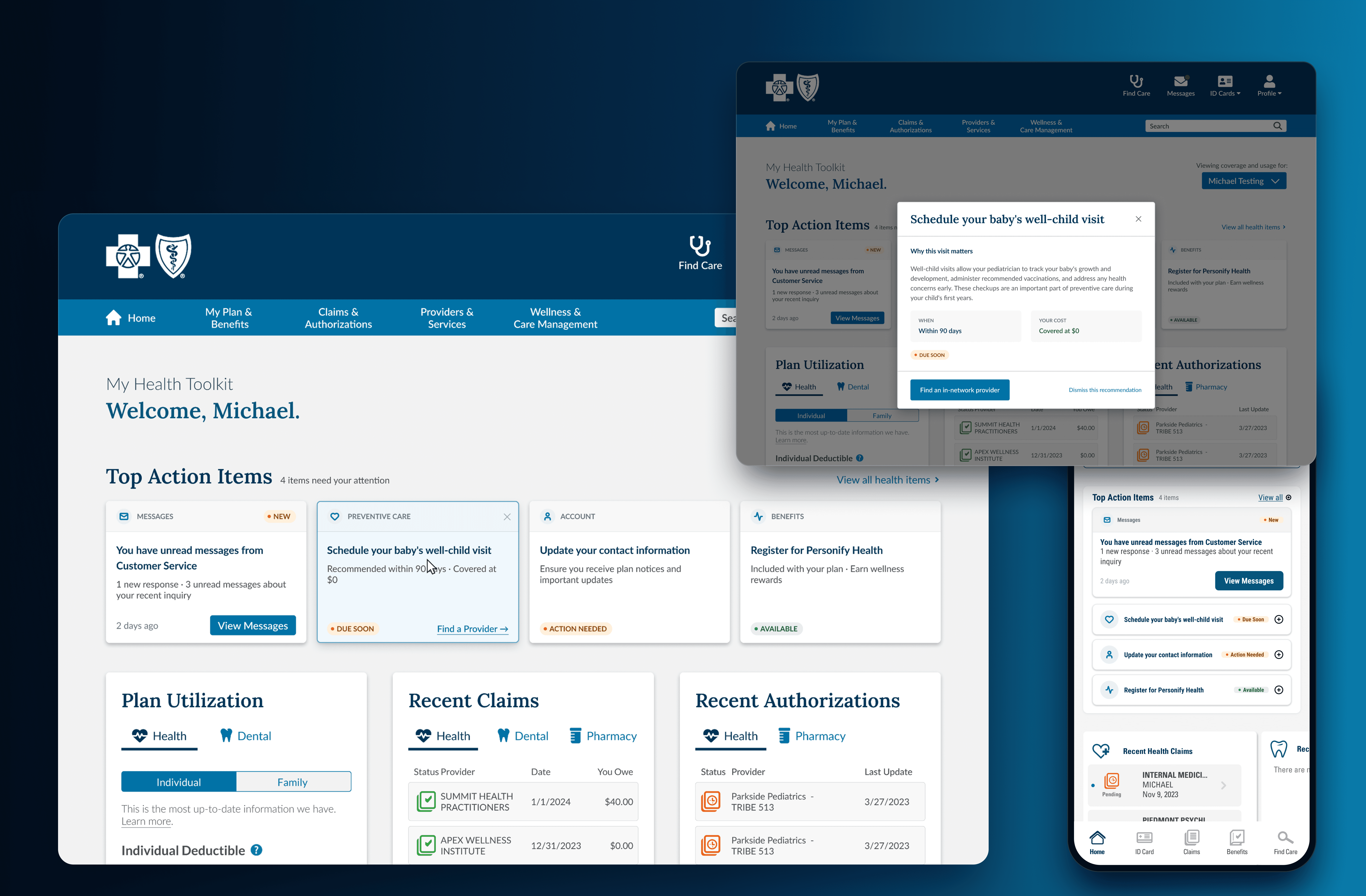
A post launch exploration of how the experience could evolve with fewer constraints.
My Role & Team
Solo UX Designer (me)
1 UX Researcher
1 Product Owner
4 Developers
Timeline
MVP 1, 3 months
Platform
My Health Toolkit,
Mobile and Web,
B2C
Key Result
+17% message reach
Context
Members already had preventive benefits available to them, but many were still missing them.
My Health Toolkit is BlueCross BlueShield of South Carolina's health insurance member portal, where members check coverage, review claims, find care, and manage their health plan.
Because members already came here to manage their healthcare, it was an opportunity to help them understand not only what their plan covered, but what to do next.

Problem
Three barriers were keeping members from acting on their benefits.
Member data, survey feedback, and journey mapping pointed to three recurring barriers.
20% unsubscribed
Messages did not reach everyone

Low message visibility
Important information was easy to miss

6+ clicks
Benefit information was scattered

The problem wasn’t adding more information. It was making the right information visible, relevant, and easier to act on.
Design Principles
I turned those barriers into three principles to guide every design decision.
Access
Surface recommendations where members naturally see them.
Relevance
Use member data to surface personalized, high priority recommendations.
Clarity
Bring important information together and make the next step easy to understand.
Exploration and Testing
The first design challenge was actually a scope challenge.
It was not yet clear whether the experience should live on the homepage, in the Message Center, or across both. Rather than wait for the scope to become fully defined, I created five rough concepts in Figma so stakeholders could respond to something concrete.
Five rough concepts helped make an unclear scope concrete and narrow the work to two testable directions.


Those explorations narrowed into two directions.

Option A brought personalized, high priority recommendations to the top of the homepage, prioritizing visibility and quick action.
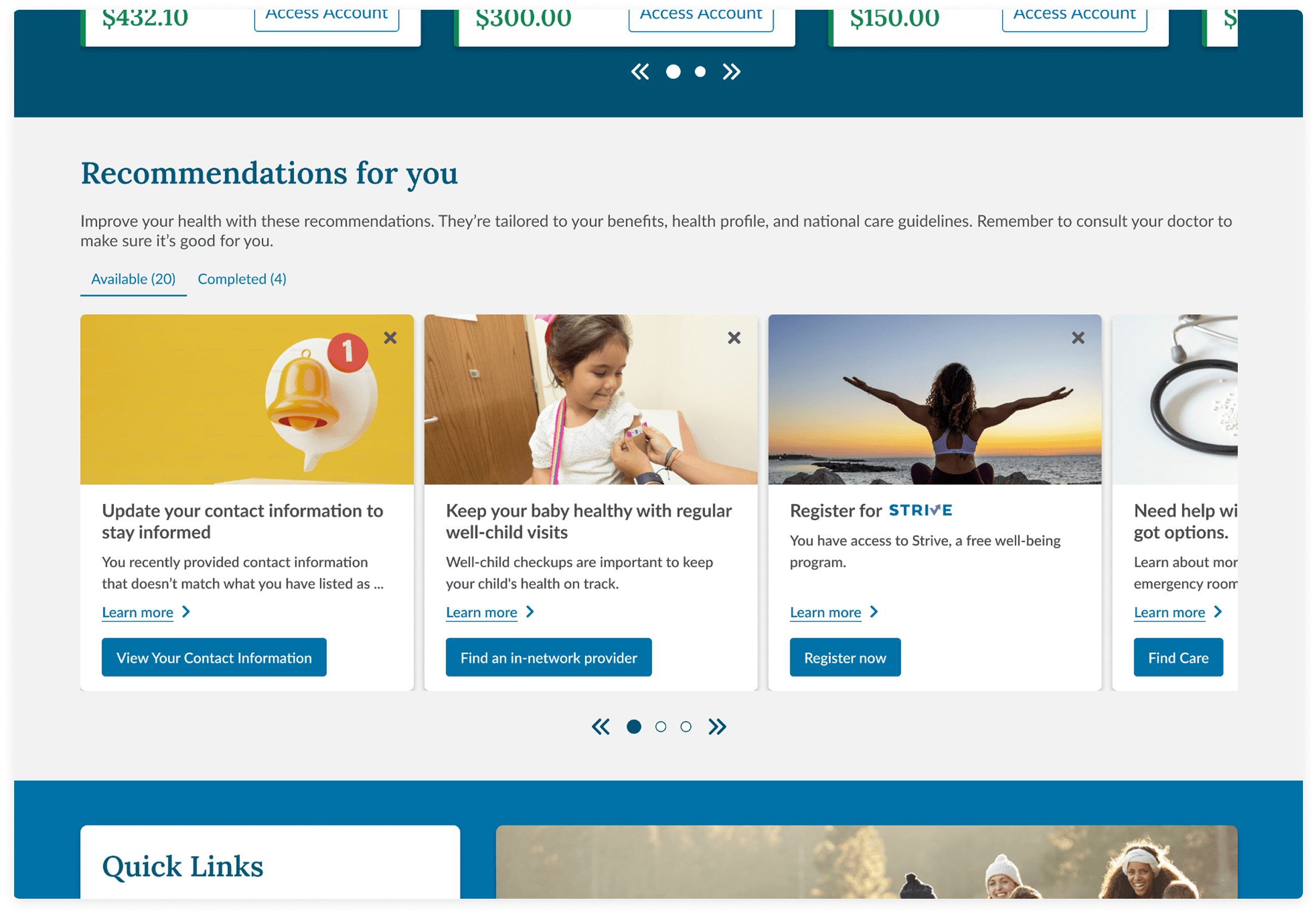
Option B offered more benefits to explore with additional context, but appeared lower on the homepage.
Neither direction solved the entire problem. I partnered with our UX researcher to test both with eight members, using realistic scenarios rather than simply asking which design they preferred.
Key Decision
Testing showed that the concepts supported different needs at different moments.
Option A helped members quickly see what needed their attention, while Option B helped them explore benefits with more context.
Option A
ACT
“What do I need to do?”
Option B
EXPLORE
“What else is available to me?”
“A or B?” → “What do we build first?”
I used that insight to reframe the product decision:
not which direction should we choose, but which direction should we build first?
Option A was quicker to deliver, while Option B required a larger build. I brought the research back into the stakeholder discussion and worked with product and design leadership to sequence the work.
MVP 1 · ACT · Option A
->
MVP 2 · EXPLORE · Option B
Research did not give me one winner. It gave me a clearer roadmap.
Iteration Highlight
Once the direction was clear, I still needed to decide how much one recommendation card should do.
Iteration 1. Checkbox cards
Based on testing feedback, I explored checkboxes to help members track what they had already addressed.
What I learned
It was unclear whether checking a box meant completing or dismissing the recommendation.

Iteration 2. Richer cards
I added more context, stronger visual cues, and clearer actions to make each recommendation easier to understand.
Tradeoff
The cards became taller and pushed important homepage content below the fold.

Final Design: Simple and Accessible
Instead of forcing one card to handle both needs, I separated quick scanning from deeper context. Recommendations stayed compact and easy to scan, while members could open a detail view when they needed more information.
Built for feasibility
I reused existing design patterns and components the engineering team already supported within the timeline.

The Shipped Experience
The shipped MVP brought personalized recommendations into the homepage while keeping deeper context one interaction away.

Impact
The shipped experience increased both visibility and engagement.
MVP 1 increased message reach by 17%, measured by comparing homepage message view rates before and after launch.
+40% follow through
+14% benefit engagement, measured through benefit page visits, CTA clicks, and benefit utilization
+7 pts customer service satisfaction
Together, the results showed that bringing personalized recommendations into the main homepage experience did more than make information easier to see. Members engaged more with the benefits and actions surfaced to them.
Exploring Beyond the Shipped MVP
After launch, I revisited the experience to explore how the same product principles could go further with fewer timeline and technical constraints.
I explored a stronger visual hierarchy, gave the highest priority action more visual weight, and brought context such as timing and cost closer to the next step. On mobile, I explored a pattern that kept the highest priority action expanded while secondary actions remained compact and scannable.
The core logic did not change. This was a future exploration of how Access, Relevance, and Clarity could be pushed further visually.


Reflection
The biggest lesson was how to move through ambiguity without waiting for perfect clarity.
When the scope was unclear, I made rough concepts. When two directions were based on assumptions, I tested them. When stakeholders prioritized different paths, I brought the research back into the discussion.
I learned to use design not only to create the final interface, but also to make decisions concrete enough for teams to react to, test, and move forward with.
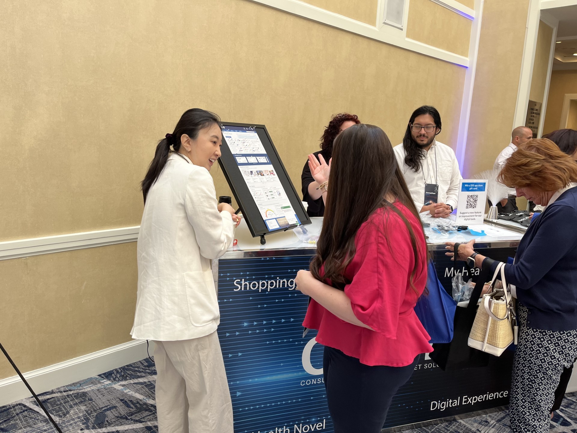
Leading in-person user testing at the BCBS Summit