MovementX
Streamlining the Patient Onboarding Process
I redesigned MovementX’s patient onboarding and booking experience to help new patients find the right physical therapist and schedule care with less friction.

My Role & Team
First and only UI/UX Designer
1 CEO, 1 CMO, 1 CTO
1 Project Manager
2 Developers
Scope
Research, UX strategy, interaction design, usability testing, design system
Platform
Responsive mobile web
Key Result
37% increase in onboarding completion
Drop off reduced from 15% to 8%
Context
Helping patients take the first step into care
MovementX is a healthcare startup that connects patients with physical therapists for personalized physical therapy care.
As the first and only UI/UX designer, I worked closely with leadership, product, and engineering across both patient and provider experiences. This case study focuses on the patient’s first care journey, from account creation to booking their first session.

Problem
15% of new patients dropped off after sign up before booking their first session.
Patients were investing time and personal information into onboarding without enough clarity, trust, or certainty that they could actually book care.
For the business, that meant losing potential patients at the exact moment they were trying to begin treatment.
Research and key findings
Understanding where the experience broke down
To understand why patients were leaving, I combined a heuristic evaluation, onboarding analytics from the operations team, and recurring issues surfaced through customer support.
These insights pointed to three recurring problems.
Too much effort upfront
Patients encountered long, open-ended questions such as why they were seeking care and what they had already tried. Many were unsure how much detail to provide, making the process feel longer and harder than necessary.
Payment before trust
Patients were asked to provide payment information before knowing which provider they might see, creating hesitation at a high trust moment.
No clear path to booking
Even after completing the onboarding process, patients still had to wait for manual provider matching without a clear timeline.

Design goals
How might we help new patients find the right provider and book their first session quickly, without confusion or unnecessary waiting?
I translated the research into three design goals.
Reduce effort
Make onboarding faster, easier, and more guided.
Build trust earlier
Give patients enough provider context and transparency before payment.
Remove the wait
Allow patients to move directly from provider matching into scheduling.
Because payment collection could not simply be removed from the existing booking process, I focused on building confidence before patients reached that step.
Exploring the right matching experience
Balancing guidance, speed, and feasibility
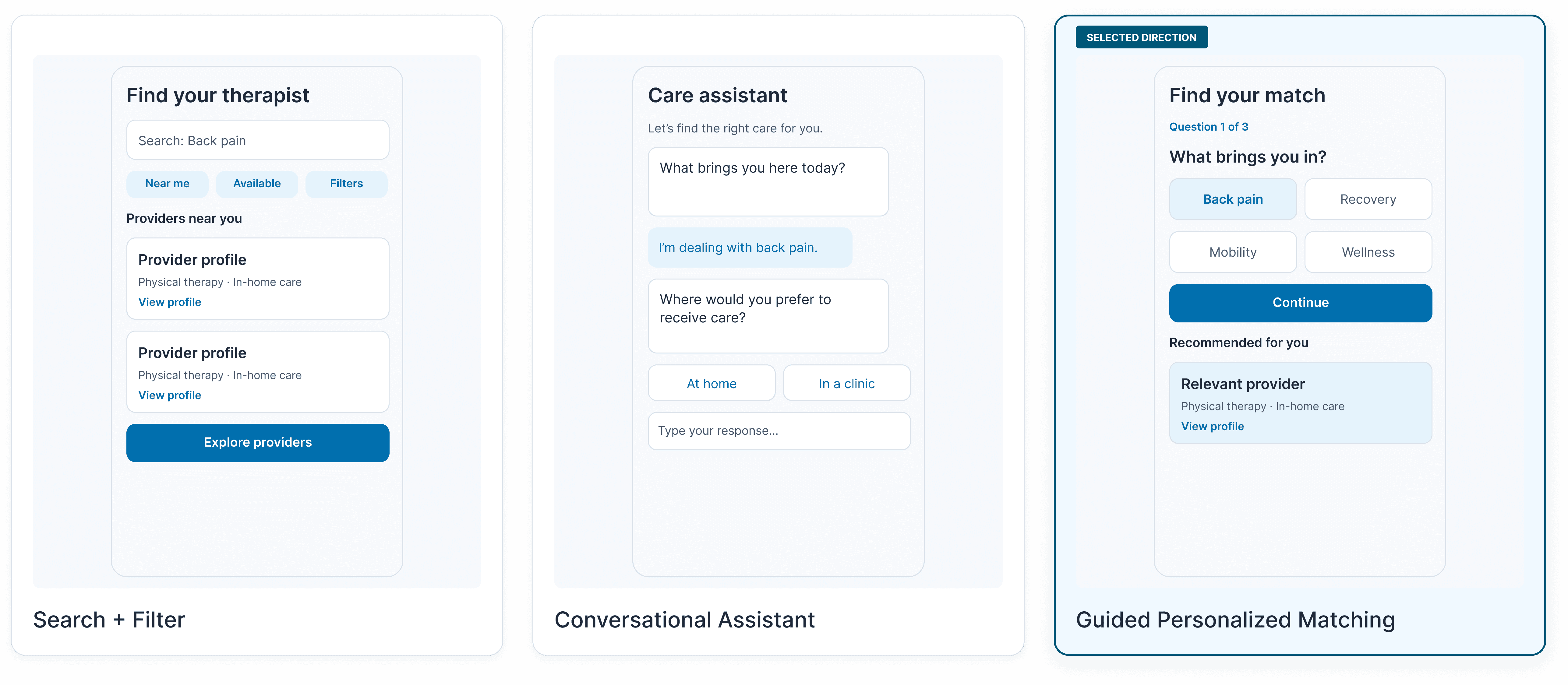
I explored three approaches for helping patients find the right therapist.
Search and filter
Patients could search by keywords such as back pain and narrow results by location or availability.
It was relatively easy to build using existing search functionality, but still required patients to know exactly what to look for.
Conversational assistant
A guided chat experience could make the process feel more personal, but it introduced additional engineering complexity, privacy concerns, and a slower path for patients who wanted to book quickly.
Guided personalized matching
A short series of structured questions could recommend relevant providers immediately using lightweight rule based matching.
I moved forward with this direction because it offered the strongest balance of personalization, booking speed, feasibility, and scalability.
Challenge
Aligning the team through user testing
Stakeholders had different opinions about question order, compliance-sensitive information, and where secondary questions should appear. Rather than resolving those decisions through preference alone, I led usability testing with five patients and providers. Participants preferred seeing symptom-related questions earlier, helping us establish a more natural sequence and a shared basis for decision making.

Final experience
A guided experience instead of one long form
Previously, onboarding concentrated demographics, consent, and long free-text questions into a dense experience. I introduced progressive disclosure, breaking the process into focused steps with structured selection patterns and clear milestone progress. This reduced cognitive load for patients and produced cleaner, more predictable information for provider matching.

Building trust before payment
Instead of asking patients to commit payment information without knowing who might provide their care, the redesigned flow surfaced relevant providers first. Patients could compare recommendations, review key qualifications and availability, and open a provider profile before continuing.

Moving directly from matching to booking
Previously, patients could complete the entire request and still wait for a provider to contact them. The redesigned experience let patients choose a provider, session type, date, and available time immediately. Clear Back navigation and milestone progress helped patients understand where they were without losing previous selections.

Designing for accessibility and scale
A reusable system for a responsive healthcare experience
MovementX serves patients with different levels of digital familiarity and mobility, so accessibility was built into the interaction system rather than treated as a final checklist.
As engineering resources became leaner, I also consolidated the booking experience into reusable components and documented their states, responsive behavior, and accessibility requirements.


Impact
The redesign improved both patient conversion and development efficiency.
The redesigned experience helped more patients move from account creation into their first booking, while reusable components supported a leaner engineering workflow.
+37% onboarding completion
15% → 8% drop-off rate
+60% development efficiency
Reflection
What worked
User testing helped move the team from subjective preferences toward shared evidence, especially when stakeholders disagreed about the onboarding sequence.
The trade-off
A conversational experience could have felt more personalized, but guided matching offered a better balance of speed, privacy, engineering effort, and scalability.
What I’d do differently
With more time, I would test with a broader range of patients, including older and less digitally confident users, validate matching quality against real booking outcomes, and continue testing the responsive system across additional edge cases and breakpoints.